
Top Do’s And Don’ts Of Website Design
A website redesign is a huge undertaking. It can be daunting to figure out where to start, let alone what to do and not do during the process. That’s why we put together this list of dos and don’ts for you! Following these simple tips can ensure an effective and successful website design.
In this post, we’ll go over the basics of excellent website design, which can take a long way toward producing appealing, actionable, converting, and optimised websites. We’ll go through seven aspects of web design as well as learning and doing’s and don’ts for each. So, without further ado, let’s get this party started.
WEBSITE LAYOUT
It’s critical to figure out the layouts before designing your website. Layouts are patterns or frameworks that define the structure of your website, including clear navigation routes within web pages by combining essential components.
Do’s of Website Layout
- Utilise the power of UX (user experience) to make your app more familiar and easy to understand for users, as they are already accustomed.
- Concentrate on making things easy for your visitors.
- Use design components that are common to most projects.
The main goal of your website design should always be to improve the user experience – and the first step in doing this is to ensure standard, simple-to-use, and recognisable UX. The design features on your website should be widely used so that visitors don’t have to think or waste time figuring out what you’re trying to say.
Don’ts of Website Layout
- Use a simple or familiar layout rather than a complex or new one.
- Don’t get too caught up in the creative process.
- Avoid clutter as it causes visual problems.
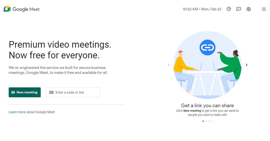
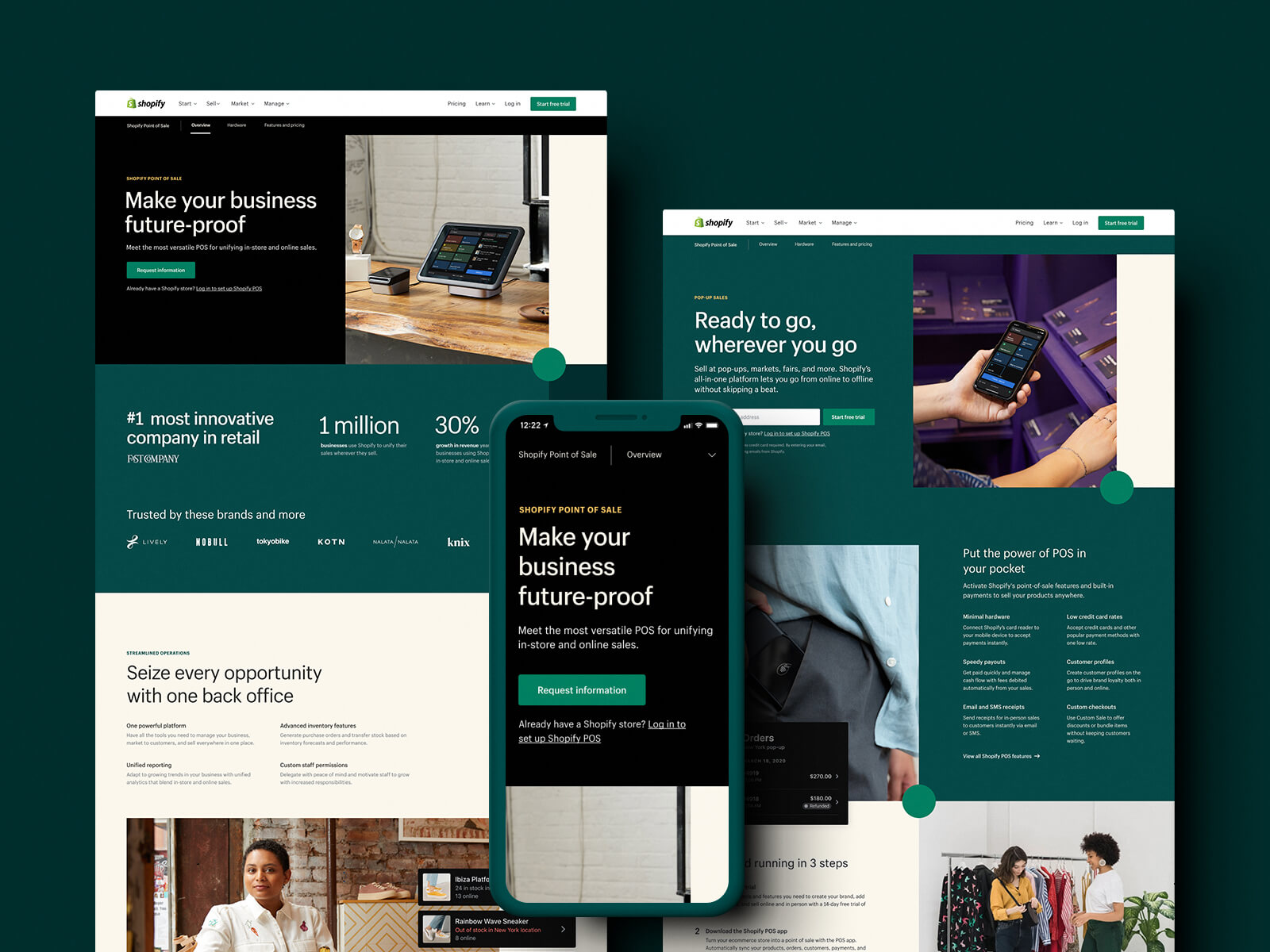
Take a look at the Google Meet website to discover how despite being one of the most influential and innovative companies, Google has prioritised simplicity and user-friendliness:
TYPOGRAPHY
Many believe that typefaces are only for web designers or experts, but this is not the case. When building a company website, it’s essential to consider more than just pictures and colours.
A typeface style guide helps you learn the dos and don’ts of font usage, which significantly influences brand recognition. The objective here is to remember that “fonts should not be an afterthought but rather the main focus of the website design process.”
Do’s of Typography
- Choose typefaces that are in keeping with the look and feel of your company.
- Make your headlines stand out.
- Make sure there is plenty of spacing between the text components.
Don’ts of Typography
- Do not use complete capitals for lengthy phrases.
- Don’t overuse a typeface that’s unappealing.
- Don’t utilise more than three distinct typefaces at a time.
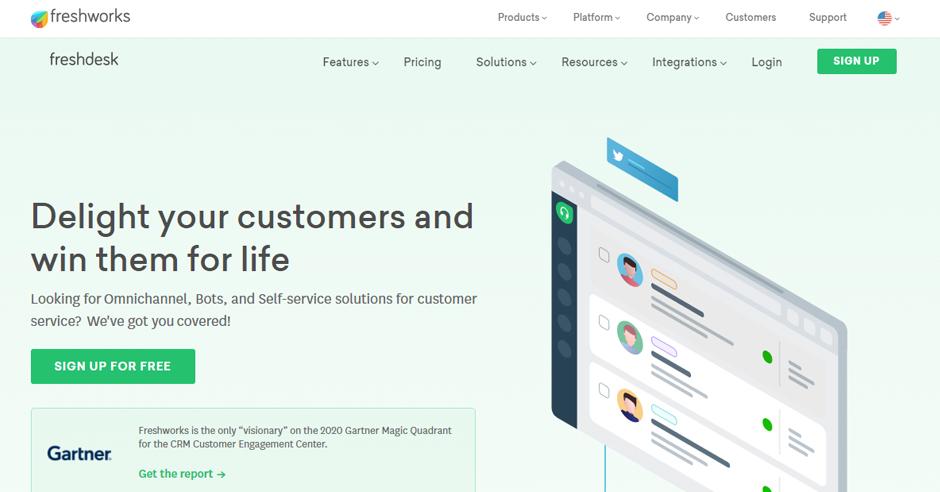
The typography of Freshworks is easy to understand and looks great on paper, conveying the company’s design and tone of voice.
Choosing the best font for your website design as a website designer is an essential factor. Typefaces have various psychological effects and visual appeal, meaning they may elicit a specific response or emotion.
WEBSITE CONTENT
The text on your website is one of the site’s most important assets. Remember to concentrate on increasing your texts’ effectiveness by improving them and ensuring they send a strong, clear message that appeals to your target market.
Do’s of Website Content Writing
- Get right to the point and provide helpful, catchy, and informative content.
- Check for grammatical errors regularly. Proofread and double-check that your web pages are free of mistakes.
- Use numbers and bullets as needed.
- Be precise without being vague.
Don’ts of Website Content Writing
- Keep your brand voice simple and avoid being dull.
- Don’t overload your message with text.
- Don’t plagiarise.
- Keywords should not be used excessively.
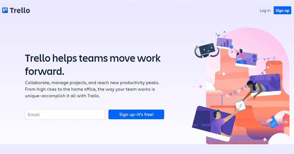
Please look at Trello’s website to see how they’ve incorporated these basic content-writing ideas.
WHITE SPACE
White space is a blank portion of your website that does not contain text or images. Although the name may appear straightforward, it might bewilder you if you don’t know how to use it. While balance in website design is critical, having too much of a good thing can make your content seem bare, and having too little can cause the material to be congested.
Do’s of White Space
- Make sure that the most crucial components are set apart from the others.
- Ample White space should be used to surround your call to action.
Dont’s of White Space
- Don’t forget to keep it simple – use the same spacing between lines of text on each line.
- Avoid focussing on the space between elements.
The website of Apple is an excellent example of how to use white space correctly. Please look at how well they have achieved balance on their page.
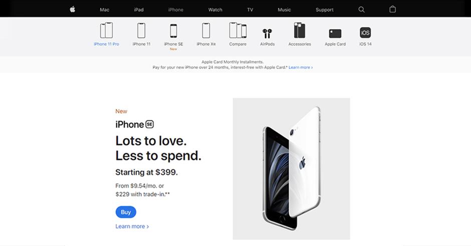
For your text content to really pop, ensure you have a lot of white space surrounding the text on your website. Consider it like yin and yang: you can’t have one without the other.
NAVIGATION
The cornerstone of site usability is the website’s navigation. In other words, it’s the primary interaction button on your website. As a result, you must score high on this question. For customers to continually discover what they’re looking for, you need logical and easy navigation on your site.
Do’s of Website Navigation
- Make your site’s navigation easy to understand by using designated menus.
- Make use of familiar phrases in the navigation.
- Follow the three-click rule: your audience should be no more than three clicks from what they’re looking for.
- Use contrasting colours for text and navigation buttons to make your designs more inviting.
- Ensure the navigation is customised to content and screen size
Don’ts of Website Navigation
- Never alter the page’s navigation.
Occasionally, web designers go too far with designs, navigation, and page layouts. However, user-friendliness is at stake when you cross the line into madness. So if you depart from the norm too far, users will have trouble locating the information they need and will eventually look for it elsewhere.
OPTIMISING IMAGES
A high-quality image is required for your website. Not only do these pictures provide a more immersive experience, but they also help to tell your company’s stories interactively. Maintaining user friendliness and following Google’s best practices will improve customer happiness and raise your search ranking.
Do’s for Website Images
- Use stock photos or photos that you have rights/licensing for.
- On each photo uploaded to your website, include Alt text descriptions.
- Resize pictures to improve the appearance and speed of your website.
- Check if all the photographs are of the same style and size.
Don’ts for Website Images
- Do not publish images of someone without their consent
- Don’t overcrowd your image file names with keywords.
- Never use low-resolution graphics on your website.
 Design by Tubik
The ideal solution is to optimise the pictures, so they don’t take up too much cloud space and provide your users with a positive experience. Apps, plugins, and software may all be used to improve photos.
CONTRASTING BACKGROUNDS
Website backgrounds have a significant impact on visitors and improve the visual appeal of websites. They allow web designers to use their imagination and make websites more user-friendly in various ways.
Do’s of Website Background Design
- Use headers for a little extra flavour.
- A splash of colour or pictures in the design can be effective. Think contrast.
- Use an attractive colour scheme for your user interface.
- Use only high-quality pictures for the background.
Don’ts of Website Background Design
- Avoid using cluttered or busy images.
Take a look at Buffer’s homepage and notice how they used a contrasting background in their hero image:
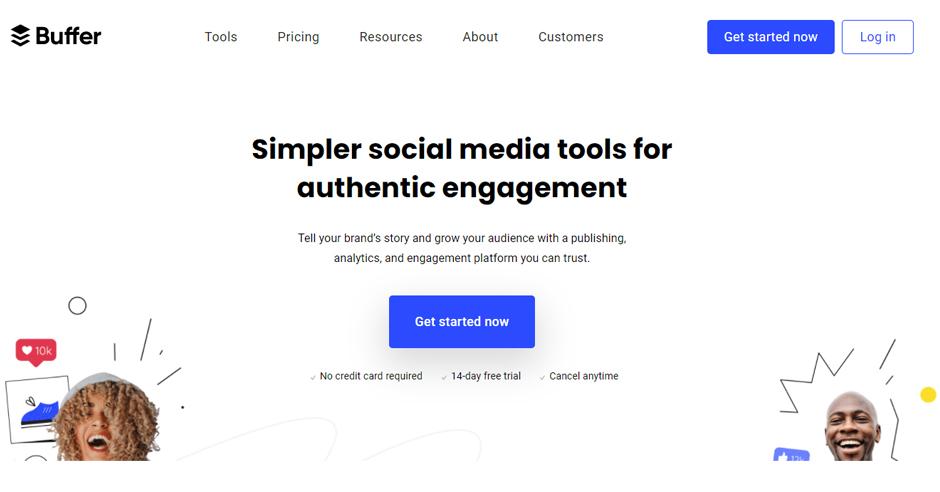
Make sure the picture you choose for your website background will scale well, even on a small screen. For example, a large image may not display nicely on the phone. As a result, if you select such a photo, you’ll have to take mobile compatibility into account as well.
BONUS TIP: FOCUS ON LESS CLICKING AND MORE SCROLLING
Users prefer scrolling over clicking, according to one of the Crazy Egg case studies. Instead of burying stuff in multiple pages, sliders, and accordions, consider putting it all on a single long page with enough information neatly dispersed throughout.
We realise that improving website performance is often a trial-and-error process. It requires a lot of practice and perseverance. However, you will notice excellent effects over time, such as increased customer experience and boosted SEO rankings.
CONCLUSION: ‘KEEP IT SIMPLE.’
A website’s success is judged by its original yet straightforward design. We tend to focus so much on creating unique online designs that we end up with overly complicated sites. The less clutter there is, the better it looks. While we encourage you to explore and find out what works best for your users, we realise that improving web performance is often a trial-and-error process, requiring a lot of persistence. However, you will start to notice increased customer experience and boosted SEO rankings over time.


![5 Ways to Improve SEO [+ bonus SEO Cheat Sheet!]](https://hey-va.com.au/wp-content/uploads/2023/02/iStock-1365949543-600x400.jpg)